Friday 22 December 2017

Hanbury animation

This is a very rough and incomplete trailer I put together for our upcoming trip to London with the Hanbury Hall event, meeting professionals and those in the industry. The movie Justice League is out soon, and although my whole being knows it will be awful, the young version of me that read Justice League in high school still holds a small bit of faith. Some of the marketing for the film has actually been quite cool, musically and visually. Hopefully this carries over into the finished film and prove me wrong, because I never actively want anything to be bad, I just appreciate that some things definitely, definitely are.

The music here is taken from that marketing campaign, a hard hitting cover of the Beatles “Come Together”. I’m not a Beatles fan, at all, but I find the last few measures of this song to be really atmospheric and engaging, something that I think our trip to Hanbury can be and will be.
I’m trying to incorporate animation, especially alongside music, into my practice a bit more, following the Baby Driver trailer I put together over the end of summer. I really enjoy working alongside a beat, and instrumentals, as it makes me think visually in a whole different sense. Things have to move, grow, change colour, disappear or explode all at different times in different ways that feel organic, as if they’ve grown out of the song itself. I enjoy making work that can exist in this medium, as it adds a lot to the way I think about my work. Not sure what the final use of this will be yet, I’m just excited for the event, so I just wanted to make something that represents that and can hopefully arouse interest in others.

Wednesday 20 December 2017

Hanbury Hall invitations

These are the final positives of the invitation sheets we have designed to be sent out for Hanbury Hall. The guests won’t receive a full version of this print, but rather a portion of it, cut into the shape of the university’s polygon logo. We thought this might be an engaging way to play with the expectations of our guests, as the invites will work almost as parts of a jigsaw puzzle, with no two people receiving the exact same image on their invite. We are basically screen printing the print at A2, and will cut it into smaller invites using what is essentially a cookie cutter method, ensuring that all the small prints are unique and distinct.

I really enjoyed working this way to make this image, as I made the digital design. The physical drawings were made by Bronte and Kieran, and I went through what they made, picked out what I thought were the most successful images and arranged them in this fashion. The inspiration was sort of a checklist of items that you might run through before going on a holiday or camping trip. Adding colour to these drawings was a good experience too, as it made me think of the work in a different light, as it isn't my drawing, so I had to consider how it works with colour in a whole different way, as I’m only receiving part of the picture. I’m happy with how these are coming out and we’re excited to get the screenprinting done with so that they can be sent out in time for January.


Monday 18 December 2017

Hanbury - idea research

After a few meetings with the group regarding Hanbury, we’ve decided that the event should be centred around a theme of travelling. As we’re all based in the North and will be heading down to London, I think it's an idea that translates clearly and sort of portrays us as explorers, which we basically are, heading into a hub of creativity to learn and share with people from different backgrounds. We put the name up to a vote across the class through a Facebook poll, and the name “You Are Here” was chosen. This name reflects the travel theme, replicating the “you are here” icon you would find on a map. Because the event in january is focused mostly on the visiting professionals, we thought the use of “you” was also engaging, as it shows that the focus of the event is us being able to meet and talk with them about our work and practices. The idea was also floated that we could call the follow up trip in July , “We Are Here”, as that will be centred more on our work, portfolios, and basically showing off what we’ve been up to for three years of illustrating.
I’ve started to meet with some other people on the course to determine a solid visual style for the marketing materials, but I think the theme of maps and travel will be the backbone of this.


Sunday 17 December 2017

Hanbury roughs - invite sheet ideas

I’ve been working with Bronte and Kieran to start getting a solid idea of what we want to say visually with the marketing materials for Hanbury Hall. I’ve been researching images like this as inspiration. I like the grounded and wholesome feel of work like this, as I feel it links to our course being one based in the North, with a smaller and more focused outlook on illustration, rather than a super slick glossy outlook that might be had from an institution based in the centre of London. We mainly want these materials to best represent our course, how it functions and the work that comes out of it.


Saturday 9 December 2017

Hanbury group work

The group organising the bulk of the Hanbury Hall has been assembled, and I’ve found myself on the team!
This isn’t something I’ve done for a long time, I was involved in councils and meetings at high school (I was Head Boy, once upon a time), but since then I’ve always had a job outside of college or university, so I sort of stopped being involved with things like that. So I thought that this was a good opportunity to be involved again before leaving the academic landscape for good. Because I’ve started (unwittingly) to make promo materials for the event, mostly just the short animated trailer I was working on, I’m heading the marketing side of the event, which mainly includes posters, banners and invitations. I’m looking forward to working in this group, as everyone in it seems really engaged in making the event as good as it can be, which is only making it more exciting for when we go down to London in January.

Friday 24 November 2017

King Gizzard and the Lizard Wizard - SoYoung Magazine competition

This is my entry for the SoYoung magazine illustration competition. This magazine is a very recent conception, with a relatively small but rapidly expanding fan base. This competition is the first I have heard of them but I think that it could be something that turns into a long time interest, as they seem to invest a lot of time into music illustration, something that other bigger music magazines don’t really seem to properly consider.
The brief was to illustrate a song by any band featured in the magazine, so I chose King Gizzard and the Lizard Wizard for this, to embrace the weirder side of my practice that I’ve been looking at a little bit in COP.

Wednesday 22 November 2017

IDER - Body Love

This week I was featured on the instagram account of the London based electronic duo band Ider. Their recently released song Body Love has been at the front of my mind since I first heard it, so making an illustration in response to it was inevitable. The difference this time was that I wanted this work to exist outside my own portfolio and maybe find a place to exist in the real world, connected to the music that inspired it.
I emailed the band’s manager and she was kind enough to get back to me and send the image on to the band. I don’t know if anything more could arise from this interaction, but it does feel exciting and progressive to start to reach out to these people and find some of them are excited to see your work as well. The illustration was featured on their instagram, and they have my name now, so hopefully I can send some more work their way when the time is right and I have a few more ideas in response to their music.


Thursday 16 November 2017

Bad Sounds @ The Brudenell

Last night I went to the Brudenell again for another gig, this time the band Bad Sounds. It’s become a lot easier to talk to people at these shows, as I often find people in the industry of creating anything, be it visual art or music, are usually on quite similar wavelengths. It’s been great to be able to talk to these bands at a level like this, as illustrating album covers and even a form of music reportage are both something that I would love to become incorporated into my practice going forward, especially after university. Through talking to them, I found out that all the bands visual stuff, such as album art and merchandise, is currently done by themselves. I found it really interesting to find this out, as it's evidence that you arent limited to a single field creatively, and can encompass a lot of different aspects to work that relates to one another inside your practice.

Friday 13 October 2017

Self Portrait study task

This self portrait is heavily influenced by the way I’ve mostly been working recently for COP. The text / image combination is still something I think is in the developmental stage of my practice, but I’m enjoying playing around with the different configurations. The text used is kind of my mantra at the moment, and is taken from the album title of the Norwegian band Sløtface. I work a couple of jobs throughout the week on evenings to help get through uni, and sometimes it can feel like freaking out is a large part of my daily process, but I’ve been trying to find balance between work and more work and occasionally sleeping, so I thought the line “try not to freak out” sums up where I’m at, both personally and professionally right now.


Monday 9 October 2017

Slotface @ The Brudenell / Soup Kitchen

.Slotface brudenell
Over the weekend I met the band Sløtface that I talked about in my last post, at their gig at Brudenell social club on the 30th September. I ended up going to the gig alone because my friend was ill, and honestly I didn’t expect to be relating the night to my practice whatsoever, I just expected to go listen to some Norwegian punk on my own and see off some cheap beer.
However, the performance was one of those that you see, and it enhances the music you were already familiar with, and you suddenly become aware of a whole new slew of ideas relating to it that you didn’t previously consider. After the show was over I was talking with the band at the merch table and eventually turned to illustration and the course I was doing. They saw a couple of the music based designs I worked on over the summer, and said they’d like to talk more another time. As they’re on tour, and originally from Norway I thought that was just a polite thing for them to say, as who knows when they will next be in Leeds.

But the bassist, Lasse, said that they were playing the Soup Kitchen in Manchester on sunday night, and if I could come and talk some more they’d even throw me a free t shirt. I didn’t really mind about the free t shirt to be honest, I just thought the opportunity to have another conversation sounded really cool, as the band have done a lot of protesting and campaigning in Europe, and their music has recently been a driving force for some of my work. So I went back home and thought that that would be quite cool, and sort of on a whim bought a ticket to the gig and went to Manchester the following day.
While this experience hasn’t necessarily ended in a big commission of work or some sort of project, I’ve found it a real confidence booster to just discuss creativity and work with a band, especially one from a vastly different background to myself. It’s helped me realise that there's a lot of opportunity waiting in unlikely places, the Brudenell is just somewhere I go with friends to listen to music and have some drinks, I didn’t expect to randomly engage with people who make music that I really enjoy and want to visually respond to.

Experiencing this on my own was also a really helpful experience as it’s kind of shown me the necessity of just throwing yourself into situations sometimes, instead of waiting around for other people. Normally I never would get a bus to another city on my own just to see what might happen, but in this instance it meant I was able to talk about creativity with some uniquely creative people that I actually look up to, and realise that a lot can come from being in the right place at the right time.
Ps.
I didn’t accept the free t shirt, as I’d rather they got some money for it from someone else, but they would not let me leave without a cassette. I thought it was a really nice gesture, and I hope to bring something more of this experience in the future.


Friday 22 September 2017

Travelling Man - British film & Tv exhibition

. Travelling Man
The comic book shop Travelling Man set a brief asking for illustration related to British film and television. This was a brief I was glad I ended up taking on, as I didnt initially sign up because of too much work over the summer, but it was definitely the right decision to try to tackle this. In relation to the work itself, I wanted to illustrate something that represents British creativity, but also would work in the context of being up in Travelling Man. Thinking about my work in context is something I’ve been consciously trying to bring into my practice, hopefully to make a more coherent body of work, rather than a directionless collection of stuff in my portfolio.
Kingsman: The Secret Service is a 2014 film based on a comic that was started in 2012 by Mark Millar. Mark Millar is someone who has been on my radar for a lot of years, having made a few of my favourite books such as Kick Ass, Superman: Red Son and Old Man Logan. Because he is British, he’s someone that I found to be a really exciting creator when I was young, as a large percentage of the industry are American, so he was one of the first creators I read that came from the same place I did.
I thought this brief was a good opportunity to reflect this appreciation of British creativity that has been a formative part of my own creative progress.
For this reason, I chose to make a graphically focused poster for Kingsman that focused on the British sensibilities of that book/film (rather than the comically insane violence that it's mostly remembered for). The Iine “manners maketh the man” is the underpinning of the Kingsman characters, as sort of James Bond inspired gentleman spies. (Who also kill people with guns hidden in umbrellas, but that’s less relevant to my point.)
I enjoyed working the fast turnaround on this brief, it gave me a lot to think about but also a limited time frame, which I found helped to cut out faffing about and focus more on the ideas I wanted to get across.


Sunday 23 April 2017

AOI Talk thoughts

Reflecting on the talk we had from Association of Illustrators, in retrospect I found it really helpful in letting me know that there is a support network there for us when we leave. I have never considered things like tax forms or contracts, but they are things that will be vital to me being able to eat when we leave uni. The talk was very honest and informative, which I found refreshing as nothing was sugarcoated for us and we were told exactly what we need to be doing in order to succeed. I'll definitely be signing up to the AOI as it seems like a really worthwhile service they provide for us, and its great to know that we aren't just totally alone when we leave.

Image result for association of illustrators

Tuesday 18 April 2017

Industry Research - Iakov Chernikov

Iakov Chernikhov, Suprematist Composition (1922):  Through my work for Responsive and 505, I came across a Russian designer and architect called Iakov Chernikov. He operated in the late 1920s onward, pioneering Constructivist architecture.
The definition of Constructivism is: a style or movement in which assorted mechanical objects are combined into abstract mobile structural forms. The movement originated in Russia in the 1920s and has influenced many aspects of modern architecture and design.

I have been recently using block shape and colour to make abstract designs, so these visuals have been massively inspiring. This is something I never even considered I'd have been looking at when we started on this course, but now this shape based design is making up for a large chunk of my practice.

"My aspiration was to completely avoid the real world and give myself over to utopias, illusions, and the ephemeral." - Chernikov, 1927.
Chernikov saw visual communication as a tool for artists to express their imagination and fantasy, and thought that realism was pretty much pointless, as it already exists, so why make it again?
This philosophy is something that aligns with how I see illustration now, I don't really see the point in super realistic drawing and I'm a lot more focused on how the artist can tell a story or explain an idea just using image.

Image result for iakov chernikhov

Wednesday 12 April 2017

Ta-Nehisi Coates: Between the World and Me

Image result for between the world and me
 This is a book I actually bought for CoP, but my project there has gone in a different direction than I first had planned, I was going to write about how visual communication changes how we perceive events in history, but I've ended up going for a more contemporary take on the idea, thinking about how visual communication changes how we perceive each other through mediums like social media.
I bought this book specifically to investigate how perceptions of black communities has altered since the 20th Century to today. The author writes the book as a letter to his teenage son, so the whole thing feels very personal and honest.

The unique way the author illustrates the story of his life and experiences growing up has made me think about alternative methods of telling a story. I've found a lot of inspiration recently towards illustration through the medium of books, especially books centred on telling a story, as that's what I'm basically trying to do in my own work.

Monday 10 April 2017

Podcasts + BrainScran


For about a year, podcasts have been a great way for me to absorb content I'm interested in through the medium of comedy. These podcasts basically do through audio what I want to do visually in my practice. They all use a wealth of otherwise useless pop culture knowledge to come up with comedy scenarios, which is literally what I do in my life all the time.

Image result for do go on pod
Do Go On centres around a weekly report on a topic, during which the two presenters who aren't reporting spend the episode derailing the report and infusing comedy into whatever subject they are talking about.

Image result for shut up a second podcast
Shut Up A Second is similar, but a lot more bizarre. The topics for each episode are purposely vague as possible, focusing on things like Bugs or Jelly. The openness means that the topic can be interpreted in any kind of way and often ends up in a completely different place to where it started. This one is how I want to think about my ideas, just letting completely loose and firing out as many funny things as I have time for.

Image result for the weekly planet
The Weekly Planet was the first of these shows I started listening to, as it appealed to the wealth of useless pop culture knowledge I have stored in my brain. It frequently reassures me to listen to this show and find that there are other people out there thinking similar things to me in relation to popular culture such as films and tv shows. Popular culture is what got me into drawing in the first place, so it will always be a massive part of my practice.

Image result for plumbing the death star
Plumbing the Death Star is another show with a way of thinking I want to start incorporating into how I think about my own ideas. The premise each week is to solve a fictional problem with real world considerations, such as how Hogwarts would perform in an OFSTED examination, or whether or not Muppets are second class citizens. This is one of my favourite shows and the completely mad situations coupled with their actual knowledge of the topics is really interesting week in and week out to listen to.

Inspired by all these shows, I've recently started writing on my friend Tom from Foundation's blog about music and film, Brain Scran. I don't have a lot of time to be frequently writing on there, but it is a good experience to put my feelings about certain things out there through that medium. Hopefully in the summer I'm going to start posting there a lot more regularly.
https://brainscran.wordpress.com/


Wednesday 5 April 2017

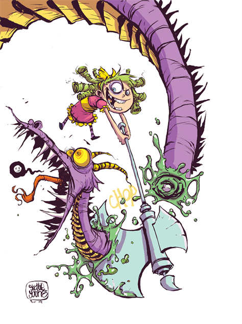
Industry Research - Skottie Young

Image result for skottie young i hate fairylandIn keeping with my departure from conventional comics, I've leaned hard into the weird stuff that Image is putting out, namely I Hate Fairyland by Skottie Young. I came across his work last year when I saw some of the variant covers he was producing for Marvel, but he never illustrated full issues so I wasn't really that familiar with his work.
Image result for skottie young marvel His style combines super deformed childlike cuteness with scenes of often horrible and biologically accurate scenes of carnage. After reading I Hate Fairyland, I now realise why he wasn't illustrating full issues of the Avengers, as any child audience would have likely been scarred.
Image result for skottie young i hate fairylandHis combination of children's illustration and horrible gore appeals to an audience who understands the juxtaposition. I really enjoy this series because its a creator writing and drawing exactly what he wants, and that's refreshing to see in comics for me, as I was so used to formulaic superhero comics last year.

Wednesday 29 March 2017

Preparing for Presentation - Life's a Pitch

We met again today to sort out the ins and outs of which parts of the presentation each of us will be presenting & talking about. It's been a challenging and interesting experience working as a group towards this presentation, as its easier to be confident as a group compared to presenting a pitch alone. We all have quite similar ideas towards how we'd want this publication to work so creatively its been easy to produce ideas and ways of solving the problem.
All we have to do now is present it. Hooray!


Also here we are as Power Rangers for the last slide in our presentation. Always good to end on a laugh.

Monday 27 March 2017

Life's a Pitch - group meeting + rationale


Here we are working beautifully as a lovely team.

Our group for Life's a Pitch is focusing on children's publishing, mainly on improving all those tacky colour explosion magazines we all had as children, usually to get some sort of toy or gobstopper. We thought that we could suggest a publication that encourages creativity in its audience, and active participation with things like dot to dot.

We made a rough plan of our rationale (and Ben made a sweet logo):


PUBLICATION FOR KIDS AND A WEBSITE
Sports page
Music
Activities and games – colour in pages, dot to dot, wordsearch
Stories
Kids send in their drawings – competitions
Animals
History
Boys and girls
5 – 9 year olds

NAME: ArtyFacts
Rationale:
Audience: 5-9 year olds, their parents, teachers
Delivery: a magazine available in shops or from our website, free copies in libraries? – workshops in kids events, shops, libraries, school visits and educational stuff, parties,
Potential partners: publishing companies, shops…?
Marketing communication: Instagram, website, facebook
Working with others benefitted
PLAN
Arty-facts
---- about us – meet the team
--- the magazine,
PURPOSE AND AIM
-guest illustrators
Future themes
--- research into existing stuff
anorak
match of the day magazine etc
------ promotion
Website
Social media
--- marketing
shops
toy shops
newsagents
stationary shops
--- events
libraries, schools etc educational sessions
history drama workshops
sports
music